Paint & Paper Library have a unique palette of colours that can pair together easily, making interior design easy for everyone.
Architectural Colours
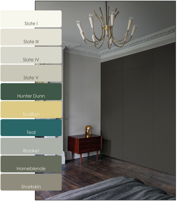
Slate I: A light, cool grey with subtle blue undertones, Slate I is ideal for creating a fresh and airy atmosphere. This colour works well in smaller spaces or areas with limited natural light, as it helps to brighten and open up the room. It’s perfect for modern and contemporary interiors, providing a crisp and clean backdrop that enhances lightness.
Slate III: A deeper, rich grey with pronounced blue undertones, Slate III is ideal for creating a dramatic and moody ambiance. This shade is well-suited for feature walls, studies, or any room where you want to add a touch of intensity and depth. It pairs beautifully with metallic accents and darker furnishings, enhancing its luxurious feel.
Slate IV: A dark, intense grey with a slight hint of warmth, Slate IV is perfect for creating a bold and sophisticated look. This colour is excellent for larger rooms or spaces where you want to create a sense of intimacy and enclosure, such as dining rooms or bedrooms. Its rich tone works well with natural materials like wood and stone, providing a striking contrast that adds character and depth.
Slate V: The darkest shade in the Slate range, Slate V is a deep, almost charcoal grey with strong blue undertones. This colour is perfect for creating a dramatic and enveloping atmosphere. It’s ideal for use in feature walls, media rooms, or spaces where a bold, sophisticated look is desired. Slate V pairs exceptionally well with lighter neutrals and metallic accents, providing a striking contrast that adds a sense of luxury and elegance.
Contemporary Colours
Hunter Dunn: Paint & Paper Library's Hunter Dunn is a distinguished, deep aubergine hue that adds a touch of sophistication and drama to any space. Named after the renowned 19th-century physician, this rich, dark colour exudes elegance and depth, making it a bold choice for interior design.
Scallion: A brilliant and vibrant pale green ideal to kitchens or as a contrast with Lusi or Slate.
Teal: A Parisian blue-green from an 18th century salon on the Rive Gauche.
Classic Colours
Blanket: A neutral, warm wraparound grey. Team it with pale woodwork like Stone II and rich primaries.
Hornblende: A serious, deep green for rainy days and grand shooting lunches. Combined with Stone V it looks contemporary; with Chaste, more traditional.
Sharkskin: Grey with a dash of violet - team with Plaster or Marble for a settled pink scheme.

