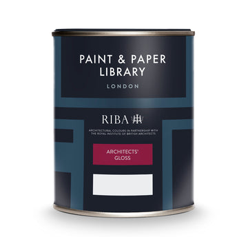

Paint & Paper Library Slate I is a very light, subtle neutral from the Architectural Colours family. Featuring a gentle grey undertone, it functions beautifully as an off-white backdrop that offers a soft, refined alternative to stark white. Slate I is particularly well-suited to ceilings, woodwork or entire rooms where you want brightness, calmness and a hint of warmth rather than strong colour.

Slate I

Slate I from the Paint & Paper Library Architectural Colours collection is a soft off‑white neutral with a subtle grey undertone — the lightest shade in the Slate family. It is designed to serve as a versatile backdrop in both modern and traditional interiors — particularly well‑suited for ceilings, woodwork or full rooms where you want brightness, calmness and a hint of warmth rather than a pure stark white.

Slate I delivers a discreet, highly adaptable neutral tone with understated character, making it an excellent foundation colour for layering neutrals or introducing accent colours across the home.

Matching Colours

Use Slate I as your foundation neutral to establish a calm, versatile base throughout your interior, perfect for walls, ceilings, and trims. From there, the Slate family can be employed to create subtle tonal layers that add depth and interest without introducing strong or jarring colours. For a more lively or modern touch, incorporate Contemporary colours such as Hunter Dunn, Scallion, or Teal, which work beautifully as accent walls, cabinetry, or furniture pieces, letting their character stand out against the soft neutrality of Slate I. For a richer, more dramatic effect, Classic colours like Blanket, Hornblende, or Sharkskin can be added to anchor the space, create focal points, or emphasise architectural details, all while Slate I keeps the overall palette bright, balanced, and cohesive.

Architectural Colours

Use Slate I paired with the rest of the Slate family—such as Slate II, Slate III, Slate IV and Slate V—to build a sophisticated tonal scheme. The Slate series is designed so each deeper variant adds subtle depth while staying within the same undertone. Designers recommend using a lighter shade (I/II) on ceilings and trims, and a deeper shade (III/IV/V) on walls to give layered dimension without introducing strong colour.

Contemporary Colours

For a more expressive but still modern palette, pair Slate I with colours like Hunter Dunn, Scallion or Teal. Slate I acts as a clean, neutral base while these more saturated hues bring personality—ideal for accent walls, cabinetry or feature furniture.

Classic Colours

To bring in richness and timeless character, combine Slate I with deeper tones such as Blanket, Hornblende or Sharkskin. In this setup, Slate I provides brightness and clarity, while the classic colours add depth and visual weight—great for creating a refined but relaxed interior.

Colour Charts

Looking for the perfect colour for your next project?

Browse the full range of colours that we offer. Use the filters to narrow down your search.

Please note: Online colour charts should be used only as a guide, due to differences in computer monitor brightness.
ShowHide Filters Click here to open up our advanced filter system. Choose from colour groups and search for specific product types to narrow down the options

Sort By