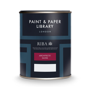

Paint & Paper Library – Hornblende is a rich, deep green paint that brings character and depth to interiors. It’s described by Paint & Paper Library as “a serious, deep green for rainy days and grand shooting lunches.” Because of its strong pigment and deep tone, it’s wise to sample it on-site and view it in different lighting conditions before full application.

Hornblende

This striking paint colour is a rich, deep green that exudes elegance and character—ideal for creating dramatic, architecturally‑led interiors. Described by Paint & Paper Library as “a serious, deep green for rainy days and grand shooting lunches”, it pairs strikingly with lighter tones like Stone V to achieve a contemporary look, or with more delicate shades like Chaste for a traditional aesthetic.

When using Hornblende, bear in mind that its depth makes it best employed where it won’t overwhelm a room—think feature walls, period woodwork, or accent‑pieces. Always test a sample in the space, as lighting conditions and surrounding finishes can significantly affect how the tone reads.

Matching Colours

Start with Hornblende as your foundation colour. From there, choose greys from the Slate series to layer subtle tone, incorporate contemporary colours for personality and accent, and bring in classic darker hues for dramatic contrast and depth. This structure gives you flexibility — whether you’re aiming for understated sophistication or bold character in your interior.

Architectural Colours

Use Hornblende alongside the gentler greys of the Slate family for a refined, layered palette. These greys bring subtle tonal variation, while Hornblende acts as an anchoring depth — perfect for feature walls, cabinetry or architectural detailing.

Contemporary Colours

Pair Hornblende with more modern shades like Stable Green, Steel I or Jaipur Pink. Hornblende provides a strong, dark backdrop that allows these contemporary hues to pop — use the bold colours for accent walls, textiles, or pieces of furniture, while Hornblende holds the scheme together with richness and character.

Classic Colours

For a dramatic and timeless effect, combine Hornblende with deeper compliments such as Steel II, Steel IV or The Botanist. These tones share a weight and saturation that complements Hornblende’s intensity, creating a cosy, enveloping feel especially suited to traditional rooms or more formal spaces.

Colour Charts

Looking for the perfect colour for your next project?

Browse the full range of colours that we offer. Use the filters to narrow down your search.

Please note: Online colour charts should be used only as a guide, due to differences in computer monitor brightness.
ShowHide Filters Click here to open up our advanced filter system. Choose from colour groups and search for specific product types to narrow down the options

Sort By