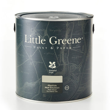
Little Greene - Portland Stone Pale (155)
Little Greene Portland Stone Pale is a light, grey-based neutral. The soft, understated tone pairs beautifully with deeper Portland Stone shades or natural materials

Portland Stone Pale
Matching Colours

Shop this colour
Regular price
From £9.00
Inc VAT
Sale price
From £9.00
Inc VAT
Regular price
From £7.50 Exc VAT
Regular price
From £41.00
Inc VAT
Sale price
From £41.00
Inc VAT
Regular price
From £34.17 Exc VAT
Regular price
From £46.00
Inc VAT
Sale price
From £46.00
Inc VAT
Regular price
From £38.33 Exc VAT
Regular price
From £44.00
Inc VAT
Sale price
From £44.00
Inc VAT
Regular price
From £36.67 Exc VAT
Regular price
£40.00
Inc VAT
Sale price
£40.00
Inc VAT
Regular price
£33.33 Exc VAT
Regular price
From £37.00
Inc VAT
Sale price
From £37.00
Inc VAT
Regular price
From £30.83 Exc VAT
Regular price
From £46.00
Inc VAT
Sale price
From £46.00
Inc VAT
Regular price
From £38.33 Exc VAT
Regular price
From £47.50
Inc VAT
Sale price
From £47.50
Inc VAT
Regular price
From £39.58 Exc VAT
Regular price
From £49.50
Inc VAT
Sale price
From £49.50
Inc VAT
Regular price
From £41.25 Exc VAT
Colour Charts
Looking for the perfect colour for your next project?
Browse the full range of colours that we offer. Use the filters to narrow down your search.
Please note: Online colour charts should be used only as a guide, due to differences in computer monitor brightness.