Farrow & Ball - Wimborne White (239)
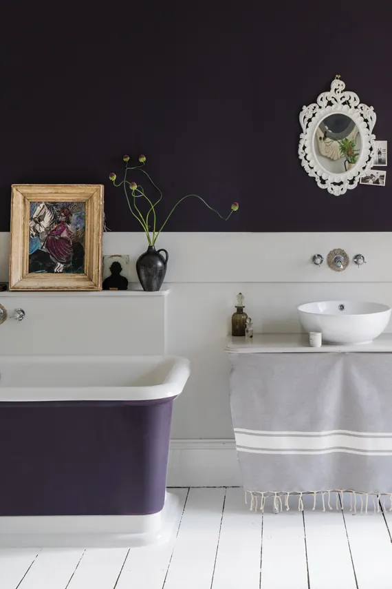
Wimborne White is named after the market town of Wimborne, the home to the first Farrow & Ball factory and still the site of our head office. It is just Off-White with the addition of the smallest amount of warm pigment to create a very versatile white which is just a little softer than All White but can still be used in contrast to any other Farrow & Ball colour.
Wimborne White
Farrow & Ball's Wimborne White is a soft, warm white that exudes a sense of purity and brightness. Named after the historic town of Wimborne in Dorset, this elegant shade is part of Farrow & Ball's "Traditional Neutrals" collection. With a subtle yellow undertone, Wimborne White maintains a clean and fresh appearance without veering into starkness, providing a welcoming and inviting backdrop for any room.
Wimborne White is exceptionally versatile and works beautifully in a variety of settings, from contemporary to traditional interiors. It is ideal for creating light, airy spaces and can be used on walls, ceilings, and woodwork to achieve a seamless and cohesive look. Its adaptability allows it to pair well with both bold colours and other neutrals, enhancing the brightness of vibrant hues and offering a soft contrast to deeper shades. This timeless white brings a gentle warmth to interiors, ensuring a harmonious and balanced environment that remains stylish for years to come.
Colour Schemes
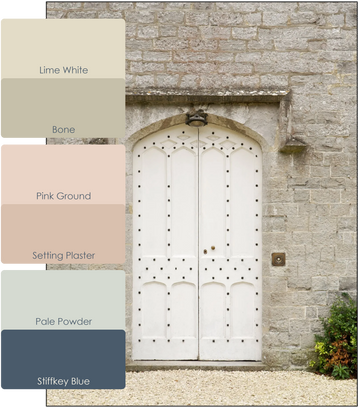
Farrow & Ball's colour card includes a large range of gentle neutrals with matching bold accents. This makes it very easy for anyone to choose a colour scheme for their home.
Lime White and Bone
Lime White: This timeless off white is named after the chalky pigments used in original distempers. One of Farrow & Ball's Traditional Neutrals, its soft tone is created by the addition of a small amount of green pigment.
Bone: A soft grey with a touch of green, this stony neutral is simply named after the colour of bones found in the animal kingdom.
Setting Plaster and Pink Ground
Setting Plaster: This dusty pink is named after the blushing walls we often admire in newly plastered houses. It is definitely a pink in historic terms, but has a certain softness to it due to the inclusion of yellow pigment.
Pink Ground: This dusty pink started out as a delicate wallpaper background which was often requested as a paint colour. Pink Ground, with its large dose of yellow pigment, now creates the softest blush of colour for a warm and soothing finish that doesn’t feel sugary.
Stiffkey Blue and Pale Powder
Stiffkey Blue: This inky blue is named after the Norfolk beach where the mud, along with the cockles, share a particular deep navy hue. Although traditional in feel, Stiffkey Blue is often used as an alternative to Down Pipe to create a richly dramatic space with a more contemporary finish.
Pale Powder: Farrow & Ball's most popular shade of aqua is a lighter version of an archived Farrow & Ball colour, Powder Blue. Pale Powder has an unparalleled softness and in north facing rooms can read almost as a delicate grey, but it is rarely cold due to the addition of green pigment.
Shop this colour
Colour Charts
Looking for the perfect colour for your next project?
Browse the full range of colours that we offer. Use the filters to narrow down your search.
Please note: Online colour charts should be used only as a guide, due to differences in computer monitor brightness.


