Farrow & Ball - Pointing (2003)
Pointing is a firm Farrow & Ball favourite for both ceilings and woodwork in traditional settings. Named after the colour of lime pointing used in brickwork, it has a light warm undertone and fresh uncomplicated feel to it. It creates the prettiest of spaces when used on walls and always softens the look of a room when used with strong traditional colours.
Pointing
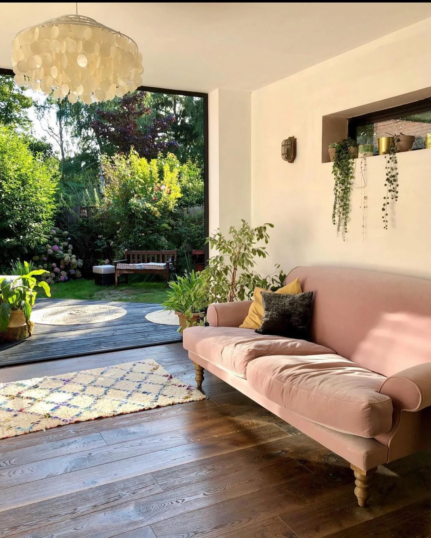
Farrow & Ball's Pointing is a soft and warm off-white paint colour known for its versatility and timeless appeal. It falls within the warmer spectrum of whites, with a subtle hint of yellow undertones that give it a creamy and inviting character. Pointing is named after the colour of the lime pointing used in traditional brickwork, which inspired its gentle hue.
This shade is popular for its ability to create a sense of lightness and warmth in any space. It works particularly well in rooms where natural light is abundant, as it enhances the brightness without appearing stark. Pointing is ideal for creating a serene and welcoming atmosphere in bedrooms, living rooms, and kitchens, where its softness can complement a variety of furnishings and décor styles.
Pointing's versatility extends to its compatibility with both traditional and contemporary interiors. It pairs beautifully with both neutral tones and bold colours, allowing it to serve as a harmonious backdrop or a striking contrast, depending on the desired aesthetic.
Colour Schemes
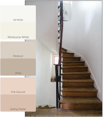
Farrow & Ball's colour card includes a large range of gentle neutrals with matching bold accents. This makes it very easy for anyone to choose a colour scheme for their home.
All White and Wimborne White
All White: All White is exactly what it says! Unusually, it contains no other pigment except for white, creating the softest most sympathetic colour without the colder blue undertones of a brilliant white.
Wimborne White: This just off white is named after the market town of Wimborne in Dorset and home to Farrow & Ball. Only a shade away from a pure white, the addition of the smallest amount of warm yellow pigment creates a very versatile shade which is just a little softer than All White.
Stirabout and Jitney
Stirabout: Stirabout is inspired by the nurturing porridge favoured over many centuries in Ireland. An earthy tone with just a hint of underlying grey, it’s perfect for creating a relaxed feel, which will never be too cold.
Jitney: This earthy colour sits somewhere between the more traditional Oxford Stone and greyer Elephant's Breath. Though muted, it is incredibly uplifting and reminds us of lazy days by the sea - hence sharing its name with the bus that whisks New Yorkers out of the hot city to the similarly coloured sandy beaches of the Hamptons.
Pink Ground and Setting Plaster
Pink Ground: This dusty pink started out as a delicate wallpaper background which was often requested as a paint colour. Pink Ground, with its large dose of yellow pigment, now creates the softest blush of colour for a warm and soothing finish that doesn’t feel sugary.
Setting Plaster: This dusty pink is named after the blushing walls we often admire in newly plastered houses. It is definitely a pink in historic terms, but has a certain softness to it due to the inclusion of yellow pigment.
Shop this colour
Colour Charts
Looking for the perfect colour for your next project?
Browse the full range of colours that we offer. Use the filters to narrow down your search.
Please note: Online colour charts should be used only as a guide, due to differences in computer monitor brightness.


