Earthborn - Freckle
This easy going, subdued orange obtains its character from the ochre and terracotta clays that it is blended from

Freckle
Colour Schemes

Shop this colour
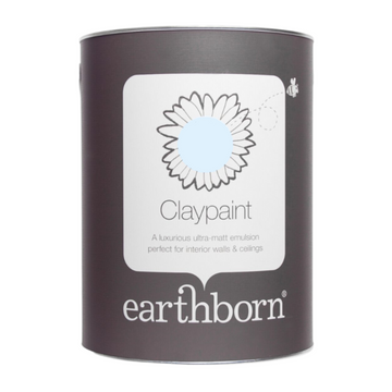
Regular price
From £56.33
Inc VAT
Sale price
From £56.33
Inc VAT
Regular price
From £46.94 Exc VAT
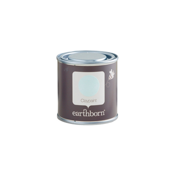
Regular price
£5.23
Inc VAT
Sale price
£5.23
Inc VAT
Regular price
£4.36 Exc VAT
Colour Charts
Looking for the perfect colour for your next project?
Browse the full range of colours that we offer. Use the filters to narrow down your search.
Please note: Online colour charts should be used only as a guide, due to differences in computer monitor brightness.