
Benjamin Moore - Rosepine (461)
This is a refined, muted forest-green hue with subtle grey undertones that add sophistication and adaptability. Its rich, earthy tone gives rooms an elegant but grounded feel—ideal for both modern and traditional interiors.

Rosepine
Shop this colour
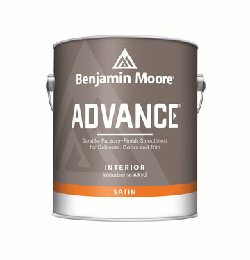
Regular price
From £32.96
Inc VAT
Sale price
From £32.96
Inc VAT
Regular price
From £27.47 Exc VAT
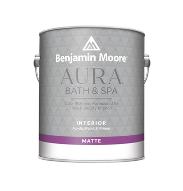
Regular price
From £39.65
Inc VAT
Sale price
From £39.65
Inc VAT
Regular price
From £33.04 Exc VAT
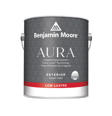
Regular price
From £40.18
Inc VAT
Sale price
From £40.18
Inc VAT
Regular price
From £33.48 Exc VAT
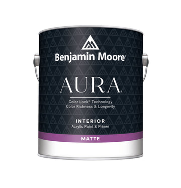
Regular price
From £36.56
Inc VAT
Sale price
From £36.56
Inc VAT
Regular price
From £30.47 Exc VAT
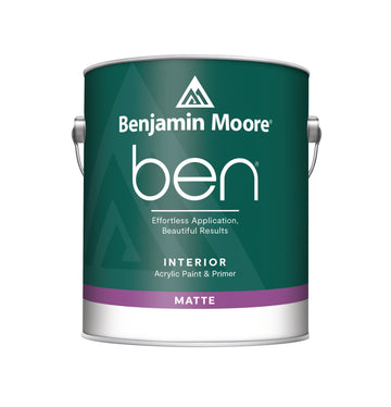
Regular price
From £21.37
Inc VAT
Sale price
From £21.37
Inc VAT
Regular price
From £17.81 Exc VAT
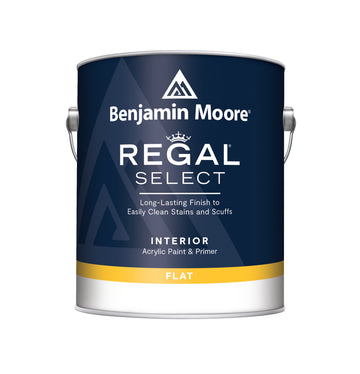
Regular price
From £30.91
Inc VAT
Sale price
From £30.91
Inc VAT
Regular price
£0.00
From £25.76 Exc VAT
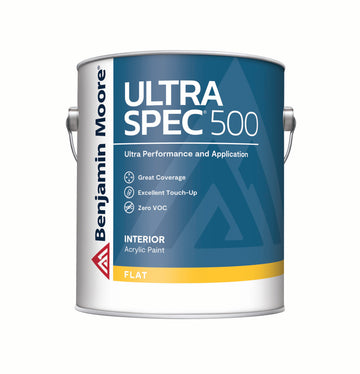
Regular price
From £62.82
Inc VAT
Sale price
From £62.82
Inc VAT
Regular price
From £52.35 Exc VAT
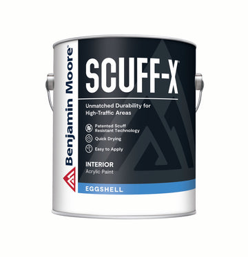
Regular price
From £39.65
Inc VAT
Sale price
From £39.65
Inc VAT
Regular price
From £33.04 Exc VAT
Colour Charts
Looking for the perfect colour for your next project?
Browse the full range of colours that we offer. Use the filters to narrow down your search.
Please note: Online colour charts should be used only as a guide, due to differences in computer monitor brightness.