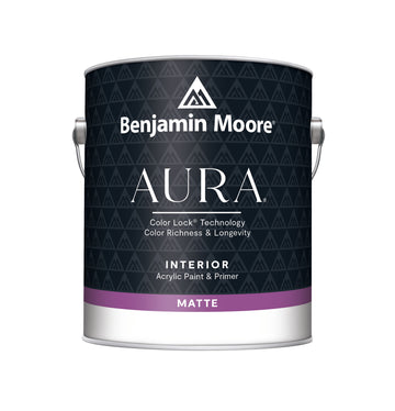
Benjamin Moore - Hale Navy (HC-154)
A beautifully deep navy-blue with subtle green and grey undertones, giving it a refined and timeless maritime character.

Hale Navy
Shop this colour
Regular price
From £32.96
Inc VAT
Sale price
From £32.96
Inc VAT
Regular price
From £27.47 Exc VAT
Regular price
From £39.65
Inc VAT
Sale price
From £39.65
Inc VAT
Regular price
From £33.04 Exc VAT
Regular price
From £37.08
Inc VAT
Sale price
From £37.08
Inc VAT
Regular price
From £30.90 Exc VAT
Regular price
From £36.56
Inc VAT
Sale price
From £36.56
Inc VAT
Regular price
From £30.47 Exc VAT
Regular price
From £21.37
Inc VAT
Sale price
From £21.37
Inc VAT
Regular price
From £17.81 Exc VAT
Regular price
From £27.82
Inc VAT
Sale price
From £27.82
Inc VAT
Regular price
£30.91
From £23.18 Exc VAT
Regular price
From £62.82
Inc VAT
Sale price
From £62.82
Inc VAT
Regular price
From £52.35 Exc VAT
Regular price
From £39.65
Inc VAT
Sale price
From £39.65
Inc VAT
Regular price
From £33.04 Exc VAT
Colour Charts
Looking for the perfect colour for your next project?
Browse the full range of colours that we offer. Use the filters to narrow down your search.
Please note: Online colour charts should be used only as a guide, due to differences in computer monitor brightness.